Upfort: From Zero Self-Service Onboarding to 80% Completion
As Principal Designer, I rebuilt onboarding, redesigned core workflows, led a full company rebrand, and built the design system. Support calls dropped by 90%.
Role: Principal Product Designer
Company: Upfort (AI-powered cybersecurity, 25-person startup)
Duration: Aug 2024 to Apr 2025 for total design changes
Scope: End-to-end product design, including onboarding, core workflows, design system, and company rebrand
Project Summary

Key Metrics
80%
Onboarding completion
90%
Reduction in CS support calls
75%
Feature activation rate
95%
Faster design-to-dev handoff
When I joined Upfort, the product worked, but customers couldn't get started on their own.
The admin onboarding experience was a six-step modal dialog that most users never finished. Almost no one completed the setup without a phone call from customer success. Every new account required hand-holding, and every hand-held onboarding was time the CS team couldn't spend on retention or expansion.
For a cybersecurity platform trying to scale to small and mid-size businesses, this was a growth bottleneck. The product couldn't acquire customers faster than the support team could onboard them.
The company also needed a complete rebrand. The previous name, Paladin Cyber, had trademark conflicts that required an immediate change. So the scope was large: fix how customers get started, rename and redesign the brand, and establish a scalable design foundation, all at a 25-person startup moving fast.
The Problem
It Started with Rebranding
Before I could redesign the product, the company needed a new identity. I led the renaming initiative, landing on "Upfort," and directed a team of designers to develop the complete visual identity: logo, color system, typography, and an illustration library.
The logo combines elements of a castle, a shield, and a knight's mask. The warmer blue was chosen deliberately. In cybersecurity, most brands default to cold, aggressive visual language. A warmer tone signals trust and approachability, which mattered for the SMB audience Upfort was targeting.
This rebrand directly informed the design system I built next. Aragorn, based on Mantine and integrated with Storybook as production React components, allowed engineers to build UI independently without waiting for design specs. That cut handoff time by 95%.
Rethinking Onboarding
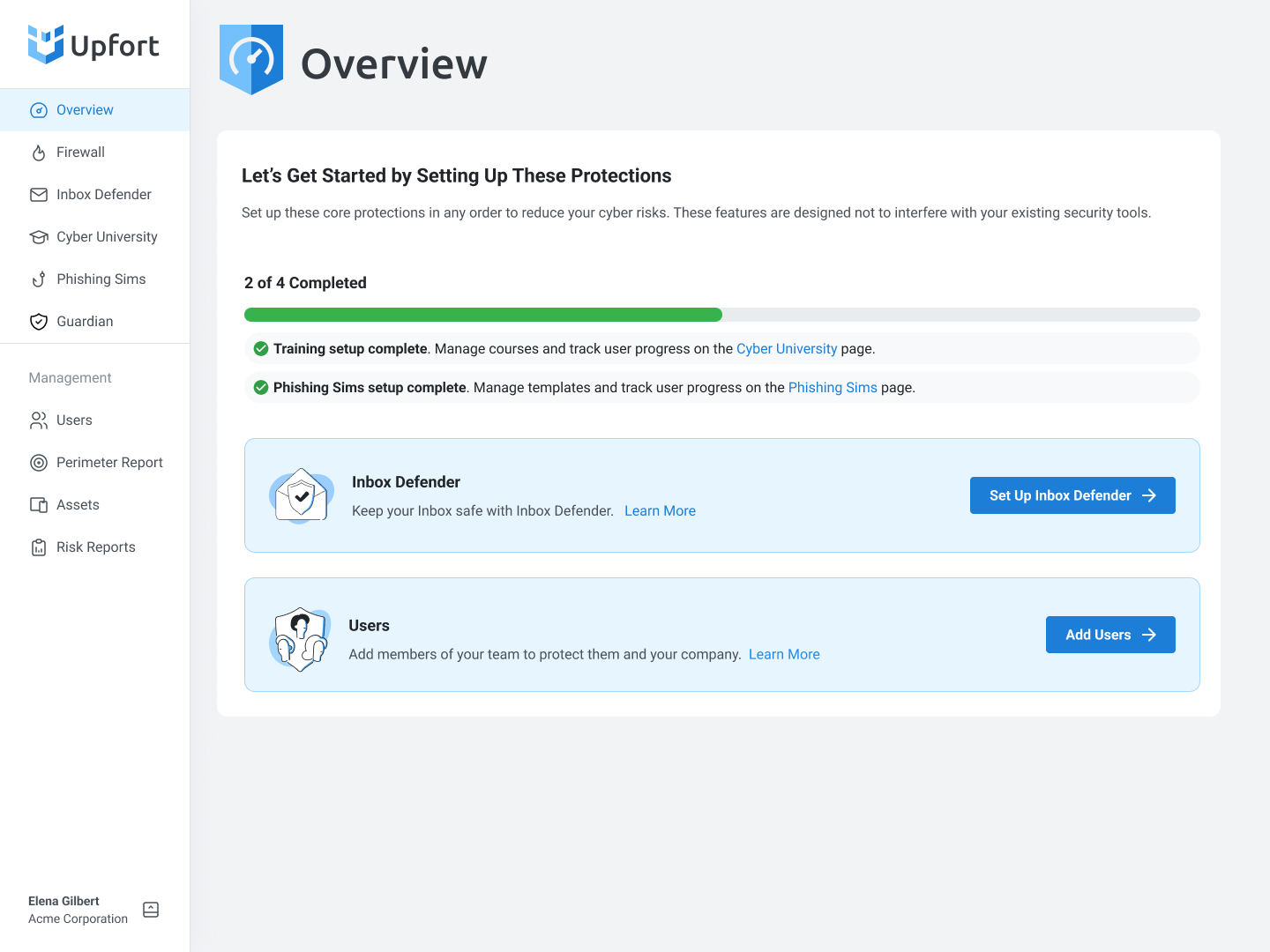
The original onboarding was a six-step modal wizard. It asked admins to configure everything upfront (email protection, user management, training settings) before they could see any value. Most abandoned it.
Working with product and engineering, I identified the core issue: the onboarding was designed around the platform's setup requirements, not around the admin's motivation. Admins didn't come to Upfort to fill out a configuration form. They came to protect their team.
I replaced the modal wizard with an integrated onboarding experience built directly into the admin overview. Instead of a gate that blocked access to the product, the new design allowed admins to explore the full application immediately and complete setup tasks at their own pace, with each task surfaced in context where it was relevant.
The result: most admins completed the full setup in their first session anyway, because each step felt like progress rather than paperwork. Those who didn't finish right away could return and pick up where they left off without starting over.
This increased onboarding completion from 0% to 80% and reduced customer success calls by 90%.
Redesigning Core Workflows
With onboarding working, I turned to the core admin workflows that drove daily engagement.
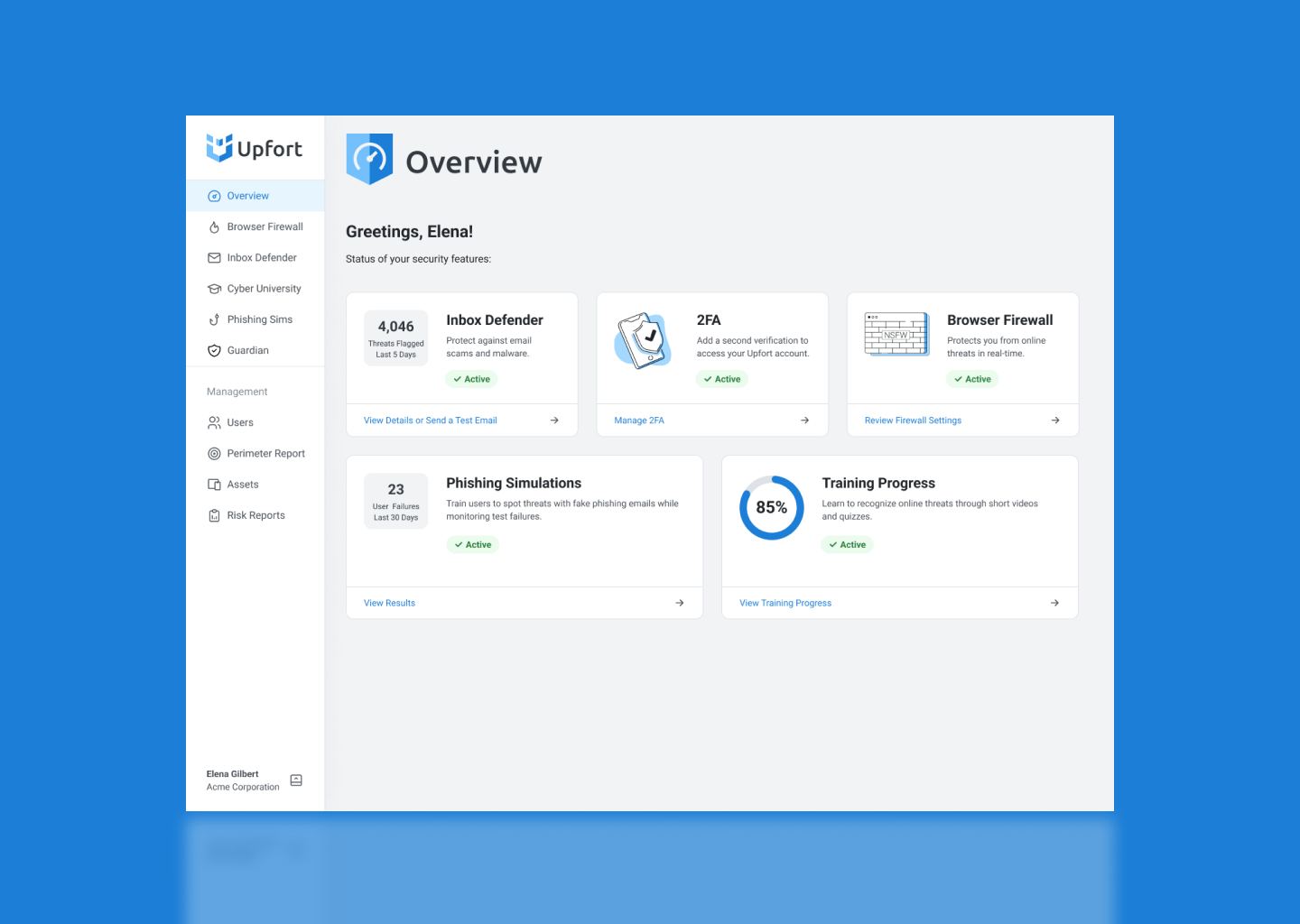
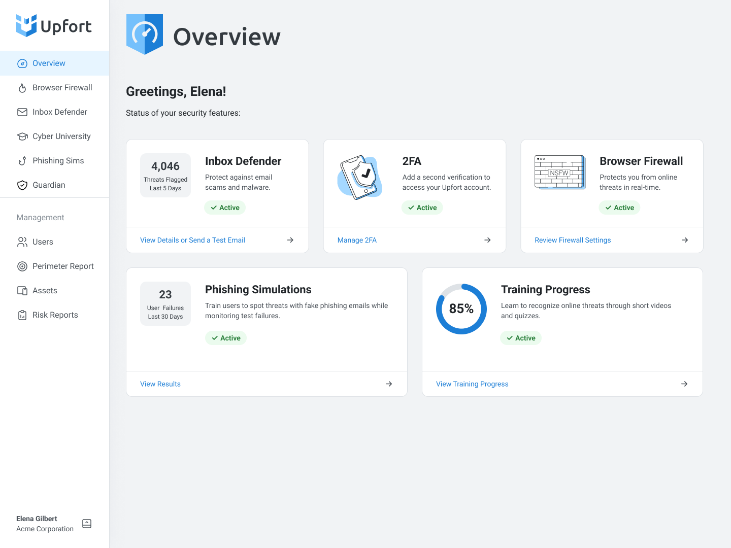
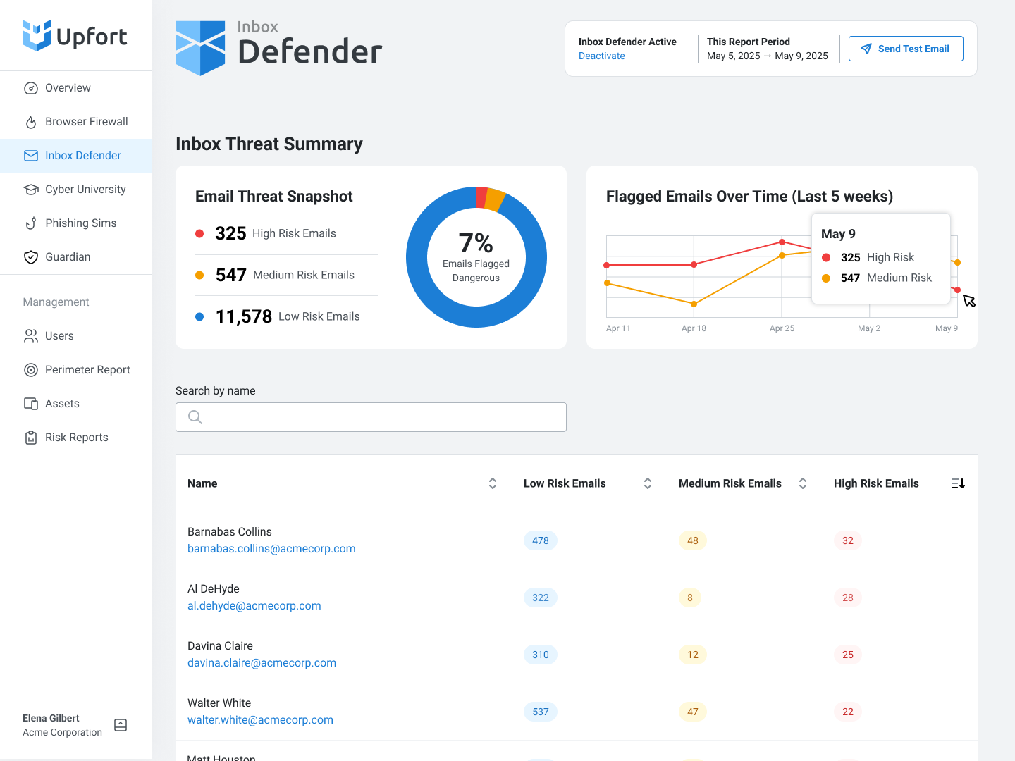
Inbox Defender
Admins needed to quickly identify which email threats required attention and which team members were most at risk, without exposing the actual email content (a critical privacy constraint). I designed a dashboard that surfaces threat severity and user risk patterns at a glance, with drill-down details available on demand.
User Management
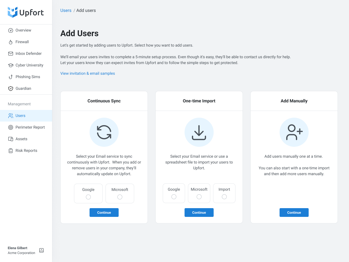
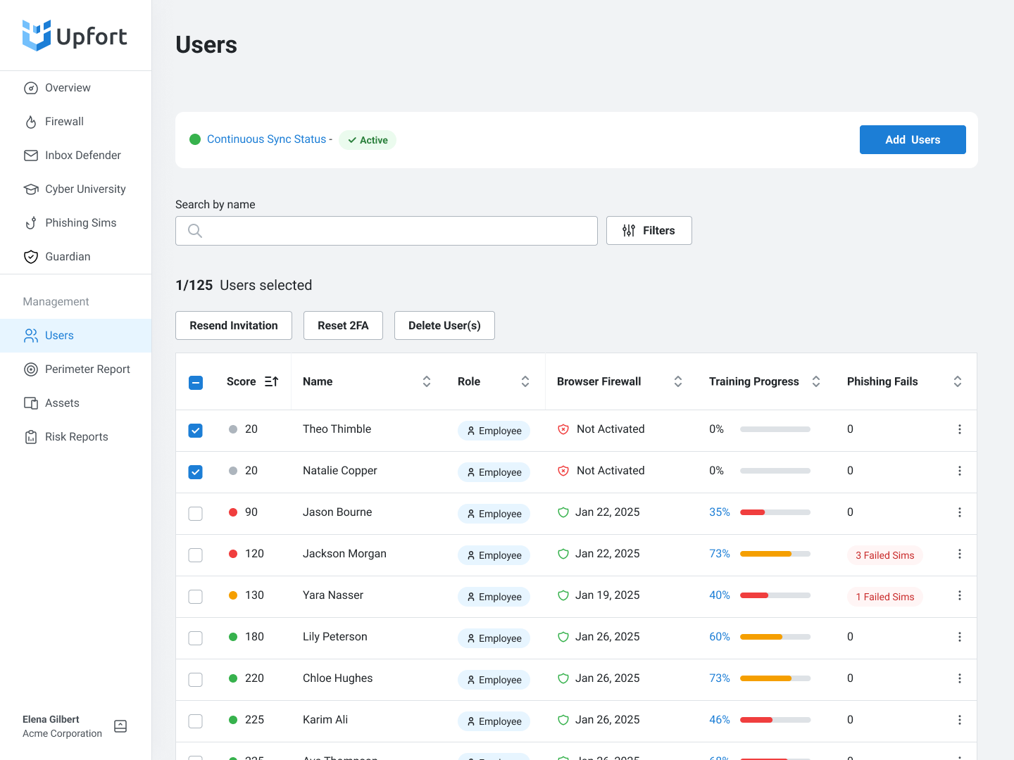
Adding and managing users had been a persistent source of friction and support tickets. The previous flow required too many upfront decisions and offered ambiguous options that confused admins. I simplified the add-user experience to reduce decision points, clarified role assignments, and designed a management view that lets admins see protection status and training progress across their entire team at a glance.
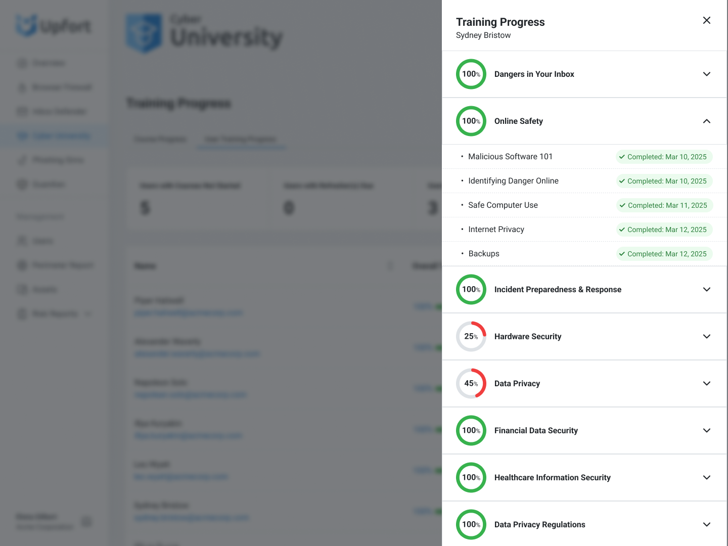
Cyber University: Training Setup and Tracking
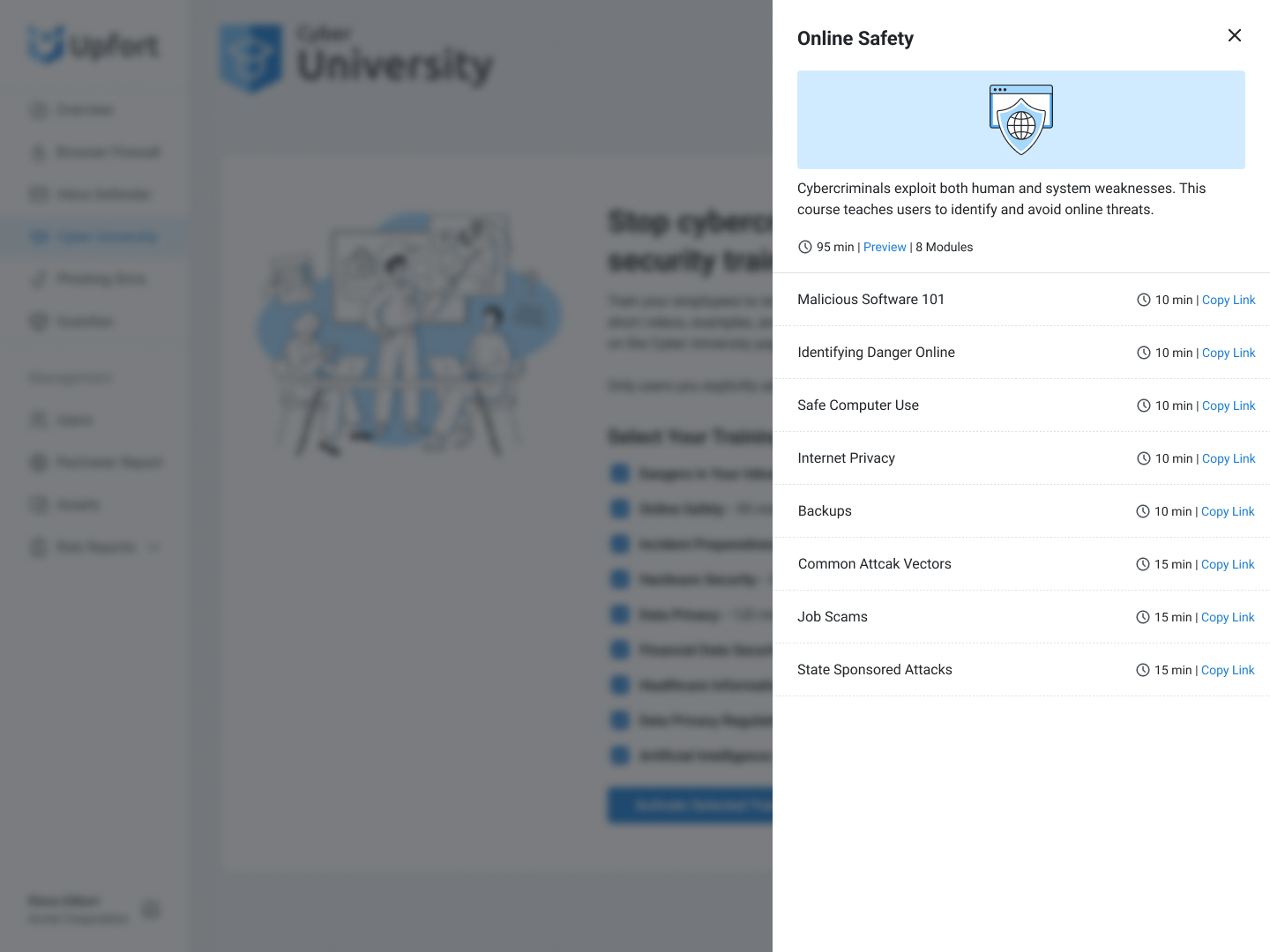
Configuring security training for a team should take minutes, not meetings. I designed the setup, so all courses are selected by default. Admins deselect what's not relevant rather than building a curriculum from scratch. Progressive disclosure lets admins review detailed course content without leaving the setup flow. The tracking dashboard provides a clear view of team progress: who has completed training, who hasn't started, and who's due for a refresher.

Over 20 months as Principal Designer, I shipped a company rebrand, a production design system, a complete onboarding redesign, and new versions of every major admin workflow. The measurable impact:
Onboarding completion went from zero self-service to 80%. Admins who previously couldn't finish setup without a support call were now completing it independently in their first session.
Customer success calls dropped by 90%. The CS team shifted from reactive onboarding support to proactive customer expansion work.
Feature activation reached 75%. Users weren't just completing setup. They were actively engaging with the product's core protection and training capabilities.
Design-to-dev handoff time decreased by 95%. The Aragorn design system, built as Storybook-integrated React components, enabled engineers to build UI independently without waiting on design.
Beyond core product work, I mentored junior designers in interaction design and contributed to the design system, and led the website redesign to support Upfort's new brand and market positioning.
Results
Testimonials
“Vytas was a delight to partner with, and three things stood out immediately.
First-principles problem solving: he dissects a fuzzy requirement down to the atomic “why,” then rebuilds a solution that feels inevitable.
Team chemistry: product managers, engineers, and even sales-focused teammates loved pulling him into sessions because he listens first, challenges assumptions second, and leaves everyone better aligned.
Speed with polish: Vytas can ship a rough cut and refine micro-interactions rapidly, and never lose sight of the bigger business goal. He has a great blend of systems thinking, collaboration, and ruthless prioritization that every early-stage team needs.”
“I had the pleasure of working with Vytas as Principal Designer at Upfort, where he consistently transformed complex, technical flows into simple, intuitive user experiences.
He built a methodical design system that streamlined our development process and was a joy for any engineer to work with. I wholeheartedly recommend Vytas for any B2B startup looking to elevate their product through thoughtful, user-centric design.”
“I had the pleasure of working with Vytas for over two years, and his impact at Upfort has been nothing short of exceptional.
Since leading our full-company rebrand, including the name, logo, product identity, and marketing site, Vytas has consistently delivered high-quality, strategic design work that elevates the entire user experience...
Vytas is a thoughtful, talented, and highly effective design leader. Any team would be lucky to have him.”