
Establishing Docuvera's Brand Identity in Life Sciences
Creating a unique name and visual identity for a powerful new component authoring platform for life sciences.
Project Summary
Challenge
Core Problems
The robust component authoring platform for life sciences documentation we were creating required a unique and memorable name that would differentiate it from competitors.
Role & Approach
Role
Founding designer at Author-it for Docuvera.
Duration
Six months.
Work Included:
User research
Brand research
Rapid ideation
Solutions
Final Deliverables:
Product name
Logo
Branding kit
Design system
Impacts
Life sciences companies have received the brand well, which remains fresh, unique, and representative of the domain.
In addition, Author-it branched off into a separate company that adopted the name Docuvera. Thus, Docuvera is now the product's name and the company that supports it.
Recent Update
On May 25, 2025, Docuvera was acquired by Bertelsmann Investments!
Designing for Emotional Experience
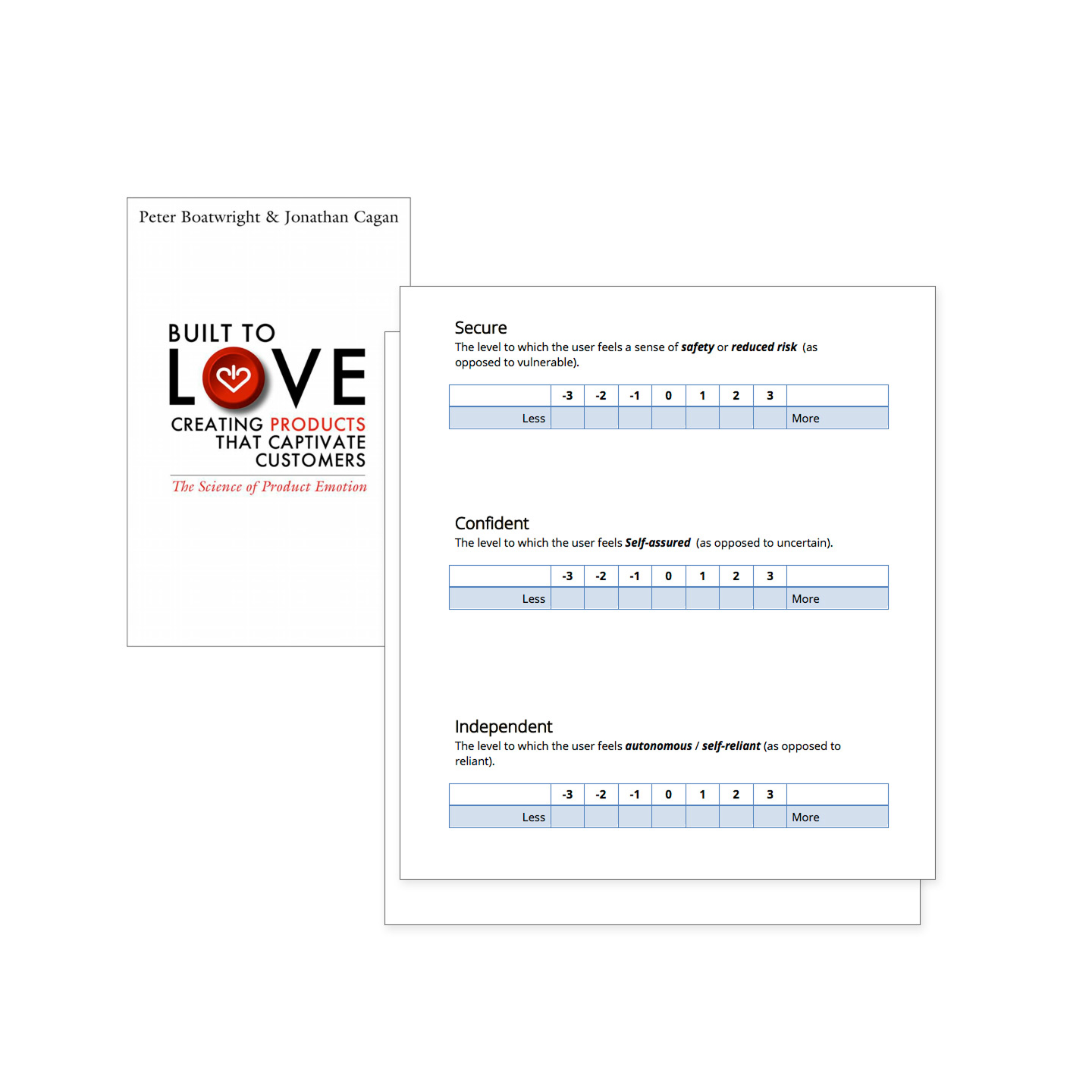
In establishing the product's name and visual identity, I recognized that successful design must intentionally shape users' emotional responses. Using the eMap framework developed by Boatwright and Cagan at Carnegie Mellon, I identified core emotional dimensions to guide our design decisions.
This approach acknowledged that emotions aren't just reactions to design—they're constructed experiences shaped by user context, expectations, and cultural understanding. Rather than assuming universal emotional responses, I used eMap as a strategic tool to understand how our specific users would likely interpret and feel about various design elements within their work environment.
My research revealed that enterprise software users needed to feel safe handling critical data (Security), assured in their ability to navigate complex workflows (Confidence), and autonomous in managing their tasks (Independence). These insights became the foundation for every visual and interaction decision.
From Emotional Insights to a Clear Set of Design Principles
I translated the emotional dimensions identified through eMap into actionable design principles, recognizing that emotions emerge from the interplay between design elements and user interpretation:
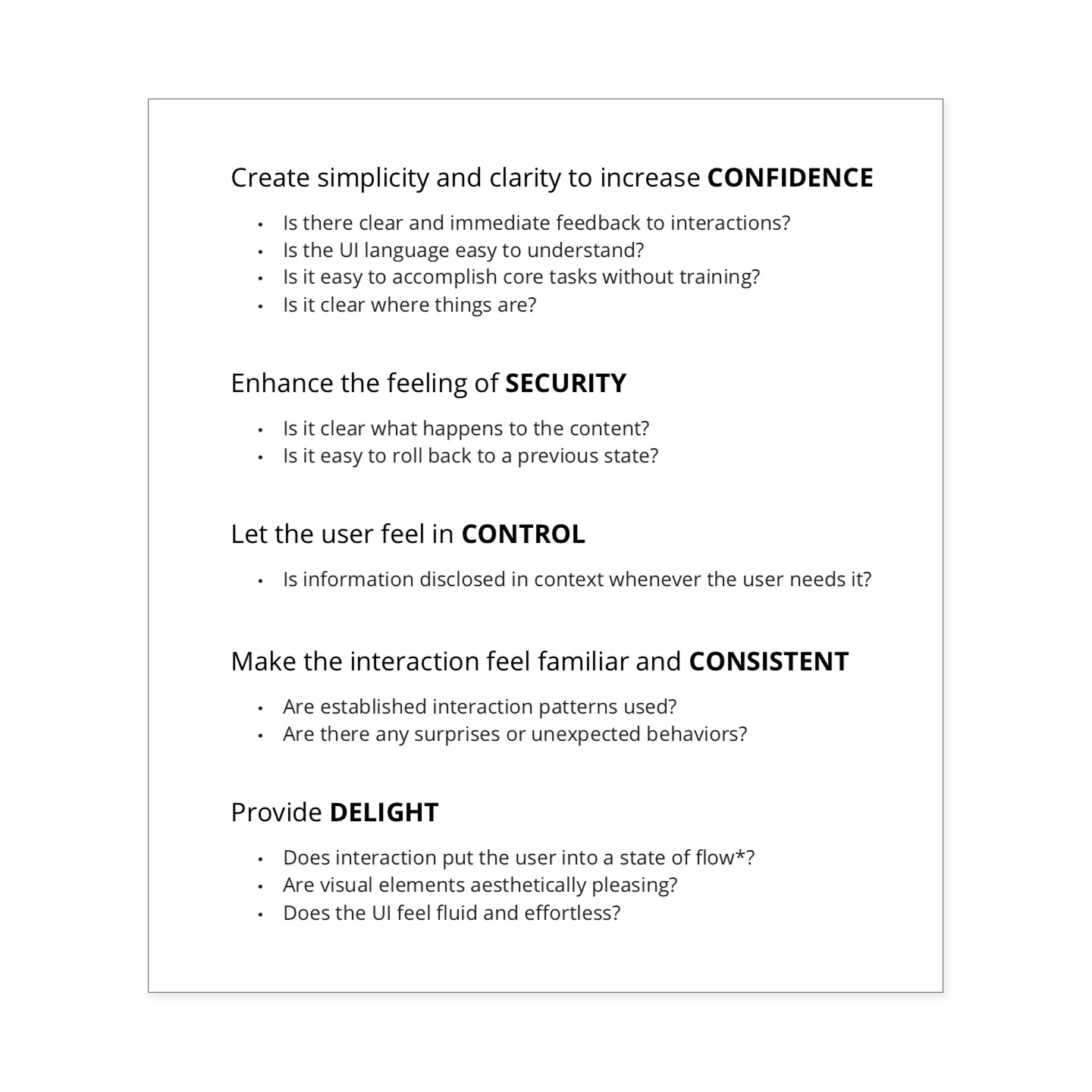
CONFIDENCE through simplicity and clarity: Clear feedback, understandable language, intuitive task flows, and obvious information architecture reduce cognitive load and build user assurance.
SECURITY through transparency: Visible data handling processes and easy recovery options address users' concerns about safety and control in high-stakes environments.
CONTROL through contextual empowerment: Just-in-time information disclosure respects users' autonomy while providing necessary support.
CONSISTENCY through familiar patterns: Established interaction conventions reduce uncertainty and allow users to build reliable mental models.
DELIGHT through flow states: Aesthetically pleasing visuals and effortless interactions transform necessary work into satisfying experiences.
These principles informed the branding initiative and guided the entire product experience, ensuring that every element, from color palette to micro-interactions, contributed to the emotional environment we aimed to create.
Key Factors for Branding the Product
There were several key factors that were critical in shaping the product identity. This included:
Differentiation from the Author-it Classic product
Position in the market (competitors, vendors, partners)
Uniqueness
Availability of the domain
Specific naming criteria
Additional Naming Criteria
Besides being able to own a unique dot-com domain, the following were additional desired requirements:
A unique name
Can be trademarked by itself (WebApp vs Author-it WebApp)
Twitter handle available
Cannot match another name or domain phonetically (Example: WebbApp vs WebApp)
Sounds professional
Easy to pronounce
Easy to spell
Easy to remember
The name must be appropriate for most common languages (there isn't a translational taboo with the name)

Over 1,000 Name Concepts
I led ideation naming sessions with the Product Team and VP of Product. We came up with several dozen name possibilities, none of which resonated.
I then crowdsourced the effort, which resulted in hundreds of additional name possibilities. Still no winner.
I then hired an external product naming consultant who proposed several other names to consider.
One stood out as a unanimous winner: Docuvera.
DOCU (suggests documents; hints at the nature of the product).
VERA (Latin, veritas: Truth, truthfulness).
We had a winner!
The Logo Had Goals Too
Docuvera is a product for life sciences authors focused on creating and maintaining various medical information documents. The following aspects drove my identity design concepts:
Corporate environments (professional and a bit formal)
Science-based users (authors have a Ph.D. in Pharmacology)
The content is scientific (drugs and clinical protocols)
The documents are highly regulated (FDA)
The heart of the product is component authoring
The primary function is writing
The research and criteria mentioned above helped me quickly sketch numerous ideas for the product identity. I wanted the logo to denote a combination of science, components, and the act of writing.
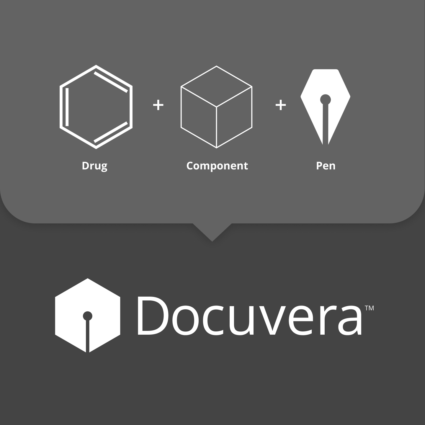
Combining Metaphors
The 6-carbon benzene ring felt right since it resembles a cube viewed as an isometric projection. Cubes can be stacked and used to build larger systems, a perfect metaphor for a component. By combining these two metaphors, I needed just one more element to make it work.
A pen tip was the element I was looking for. I angled it directly down and combined it with the benzene ring and cube to create the final symbol.
An unexpected bonus is the slight resemblance to a Spartan helmet or a warrior's shield.
Selecting the Primary Colors
As with the Docuvera combination logo, I applied the same approach to selecting the color palette. The eMAP survey, examples of the competitive landscape, the product's function, and details about the users drove the process.
In the USA*, blue is associated with truth, trust, loyalty, wisdom, confidence, intelligence, and peace. It's the color of clear skies and fresh water.
Green is associated with growth, freshness, harmony, and fertility. It's the color of leaves and lush forests.
Combining both led to a beautiful teal that the team affectionately calls Docuvera Teal. It blends warmth and user-friendliness with clean, trusting professionalism.
-----
*Color associations vary across cultures. I was mindful that the color should work well in the USA while not offending other cultures.

Extended Color Palette
I also created an extended color palette to support sales and marketing efforts. This gave our internal team more flexibility.
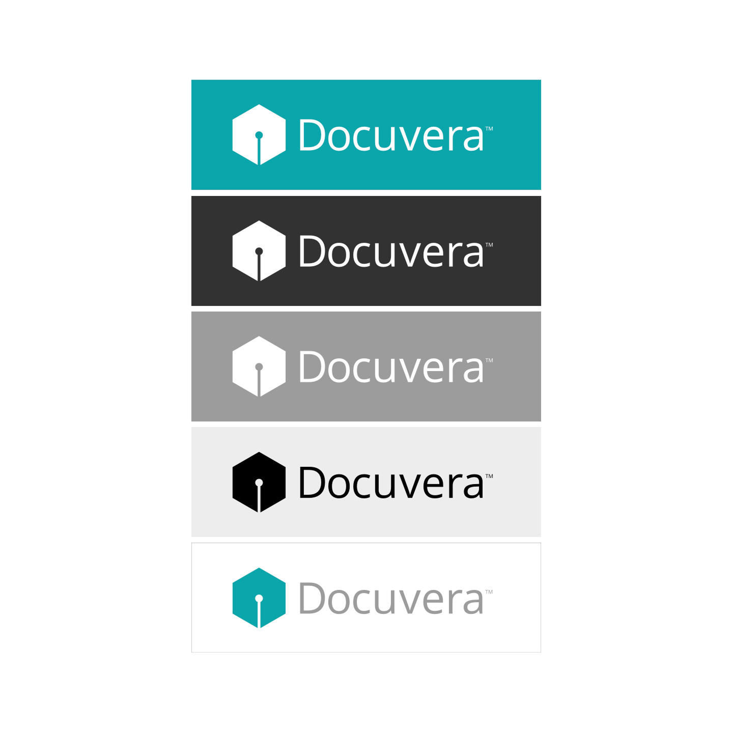
Visual Identity Usage
These examples show the visual identity and colors in use today.